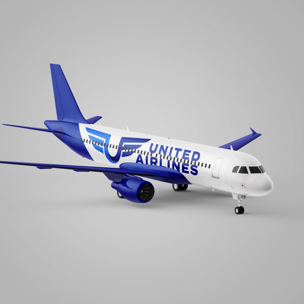
United Airlines has held the esteemed position of being the third-largest airline in the world since 2010. Despite their progressive approach to diversity, sustainability, and enhancing the flight experience through comfort and luxury, their current logo tells more of the story of unity rather than conveying its modern prestige. We decided to take a different approach.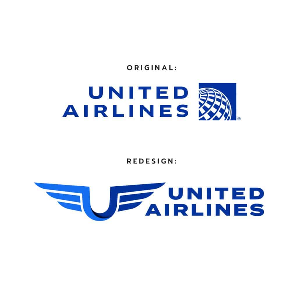
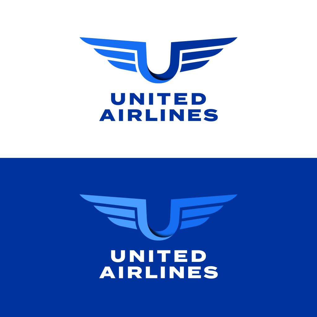
To commence our creative process, we found inspiration in the Aviator Badges, which hold a special significance within the aviation community. These badges symbolize achievement, expertise, and honor. Drawing upon the elegant shape of an Aviator Badge, we incorporated stylized wing-like elements into the logo. Our redesigned logo proudly pays homage to the rich history and heritage of aviation.
We were also keen on capturing the true essence of the word “United” as it holds tremendous significance when discussing United Airlines.
Our creative solution involved extracting the letter “u” from the word “united” and seamlessly connecting one wing to another. This design element not only visually portrays the essence of unity but also breathes new life into the logo. By incorporating this captivating depiction of “united,” we aimed to evoke a powerful sense of cohesion, collaboration, togetherness, and solidarity that lies at the core of United Airlines.
