Top 5 Design Projects of 2022
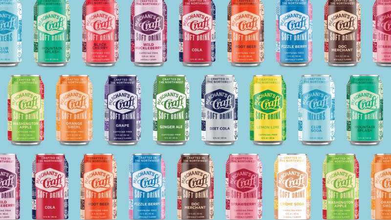
Merchant’s Craft Can Redesign
When Andrea walked in the door and told us we were going to redesign the Merchant’s Craft soft drinks and sparkling waters, I about fell out of my chair. I mean who doesn’t love to do packaging design?! Inspired by the PNW and wanting to maintain a local feel, the new design celebrates the iconic landscapes from all four states. Each label has scenes from Haystack Rock in Oregon, Mount Rainier in Washington, the lighthouses found along the Washington and Oregon coast, the Snake River Plains of Idaho, and the Mission Mountains of Montana.
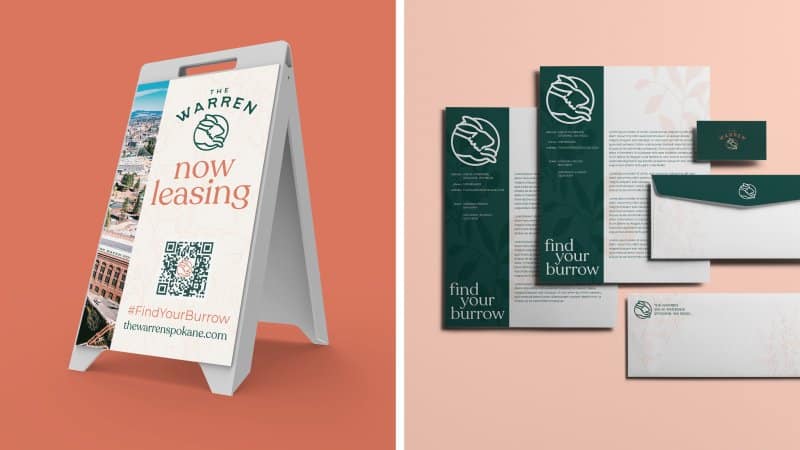
Warren
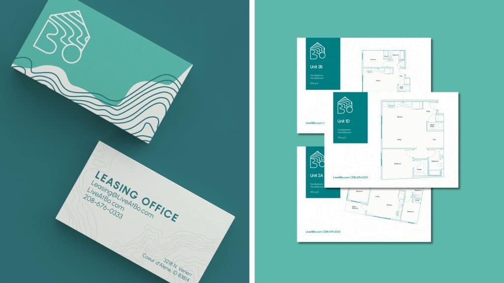
This project has been a long time coming, so when we were finally able to announce this brand, it was truly one of the highlights of the year. We were fortunate enough to be involved in so many elements of this brand new apartment building in Spokane, from naming to helping to define the interior to designing all promo material and social media graphics (every graphic designer’s dream).
Bo
With this project, we got back to work with our friends at Edlen and Co. (The Warren), which is just such a joy because we collaborate so well and therefore create some of our best work. For this building in Coeur D’Alene, they came to us with a finalized interior that was going for a modern, Scandinavian feel. To further support that, we wanted to create the feeling of relaxation and being lost in the mountains. These apartments are right on the river, so it was only natural to include this in the branding.
Back to Downtown Spokane
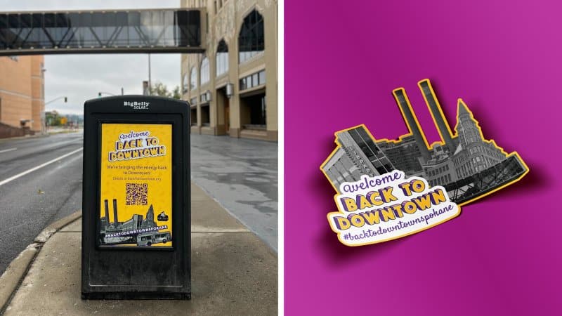
I loved collaborating with everyone at The Woodshop on this project. For this campaign, we got to create all kinds of promotional material as well as fun social media graphics to share how businesses were participating. Yes, this brand was fun to make, but it was even more exciting to see local businesses getting involved and seeing all the excitement in downtown Spokane!
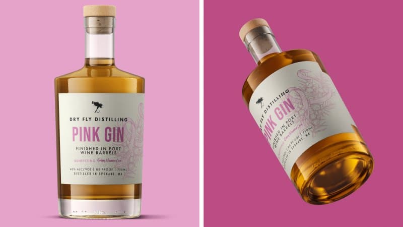
Dry Fly Pink Gin
I love every project we get to do with Dry Fly, but this one pink gin label was particularly special. When purchased, proceeds would go to the Every Women Can organization who advocate for those affected by breast cancer. On the label, you’ll see a beautiful hand drawn illustration of a breast cancer ribbon weaving through a juniper branch. With this concept, we were able to effectively tie in the Dry Fly branding as well as the Every Woman Can branding.
