Edlen & Co. reached out to The Woodshop in search of a local agency who could help tell the story of one of their new apartment buildings going up in Downtown Spokane. It started as a phone call that turned into a Lime scooter tour around the city. With the original goal of developing a brand, our relationship has since deepened and has so far resulted in three projects, with more to come.
Solution
Now known as The Warren, Riverside and Browne was our first project with Edlen & Co. We facilitated weekly meetings with GGLO (Architecture Firm), Bouten Construction, and our team to create a unified language of design for all to use while working on the project. The Woodshop led market research, profiling development, naming, and design of the brand, website messaging, collateral, and an organic social media launch.
Results
We took a parking lot that turned into a building with no natural history and created a lifestyle around the ease of living in downtown Spokane. Walk out your front door to bars and restaurants, head two blocks south to Riverfront Park, and enjoy being less than an hour to a handful of lakes and outdoor recreation. Even though the building just opened the first week of October 2022 with 141 total units available, 40 are already leased. We are more than proud to be part of a project that markets the wonderful experiences around living in our great city and changes the downtown Spokane skyline.
Check out the brand, the story, and the project in person at 206 W Riverside Ave or at www.thewarrenspokane.com. Since The Warren, we are working on a second project in Coeur d’Alene in the Atlas Mills Development and a third project in Washougal, Washington.
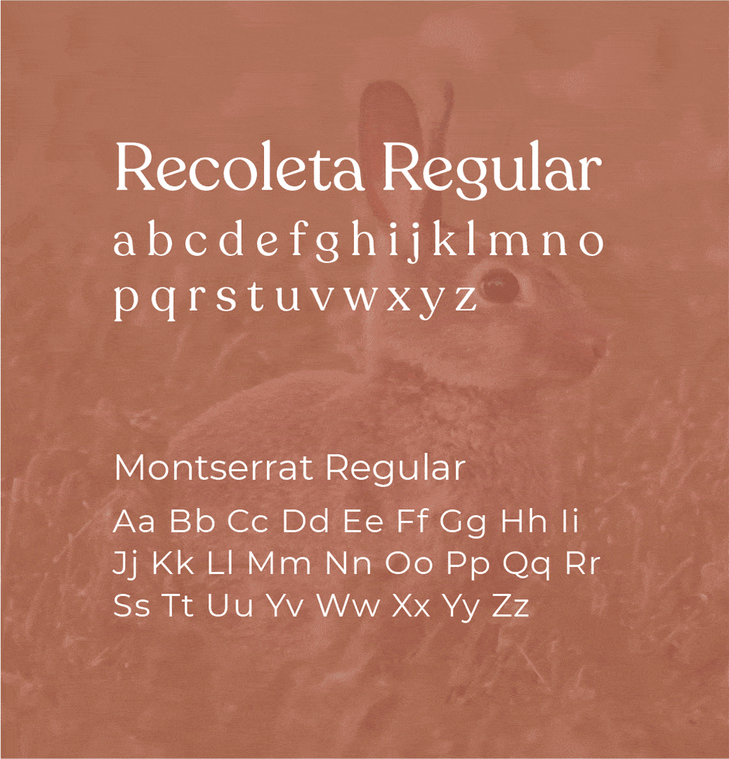
The Rabbit
Arched type to reflect how a rabbit looks when it’s jumping to give the feeling of movement and subtle energy.
Soft ruffles give a natural feel to the rabbit. This is also used stylistically as a serif on the lettering.
Circle shape to mimic the style of a burrow and to show the active rabbit getting ready to go out and about to explore.
“Large Quote from the client about this particular project. Maybe Quote an email where they thanked us.”