SGS REAL ESTATE | Branding
SGS Real Estate
Branding
Industry
Real Estate
Deliverables
- Logo Design
- Brand Strategy
- Visual Identity
- Messaging
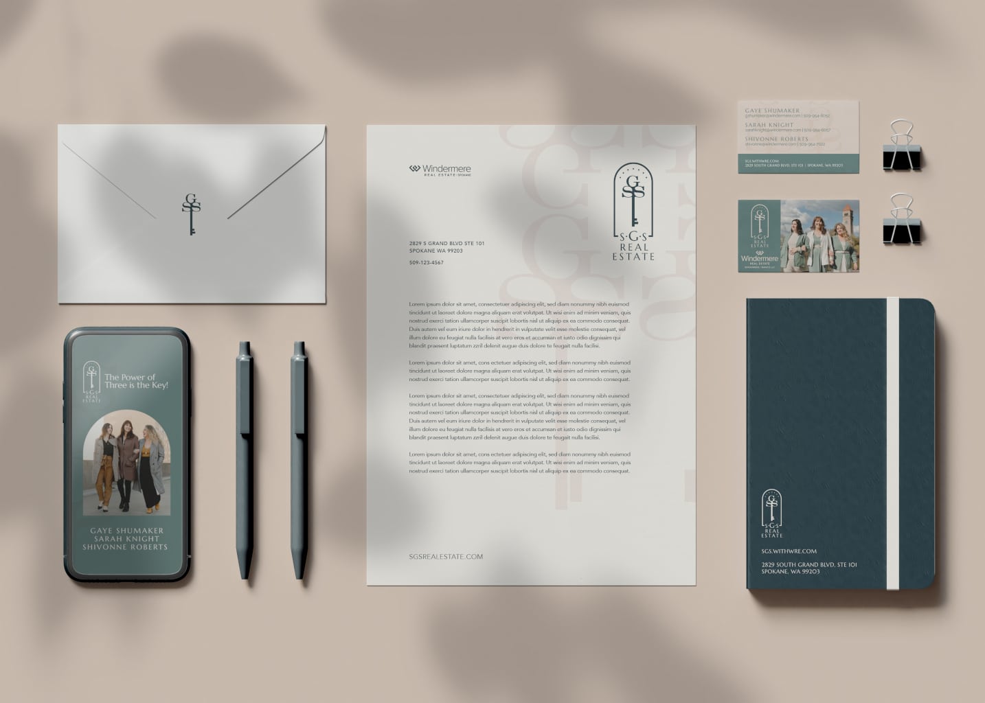
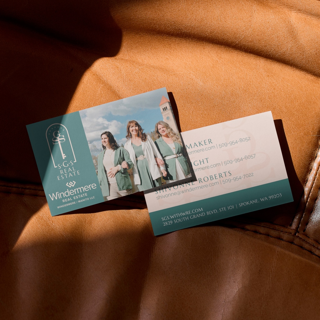
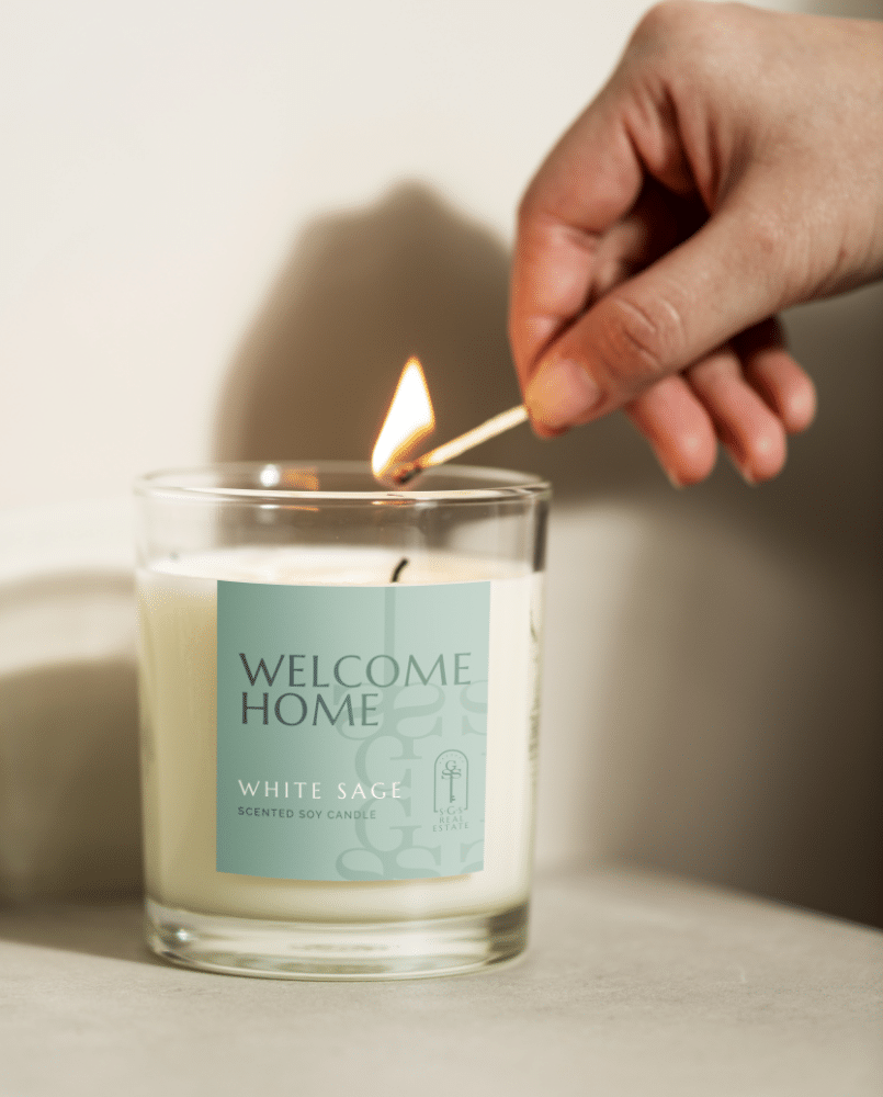
- Collateral
problem
Sarah, Gaye, and Shivonne had been working together as a team of three but needed a way to clarify that when you buy or sell a home with them, you don’t just get one realtor—you get three! The bonus to this: no matter the time or day, one of these ladies is available to answer any questions while helping you through the buying/selling process. They needed a brand that represented the three of them as a team.
Solution
The first step is a name, then a brand! TWS took SGS through our creative process to find a name that best represents Sarah, Gaye, and Shivonne. In the real estate world, personal names and brands are critical! Having two “s” names organically resulted in incorporating initials into the short and easy acronym of SGS. From there, we spent time with the ladies to get to know them personally and to organize the vision for their new brand.
Results
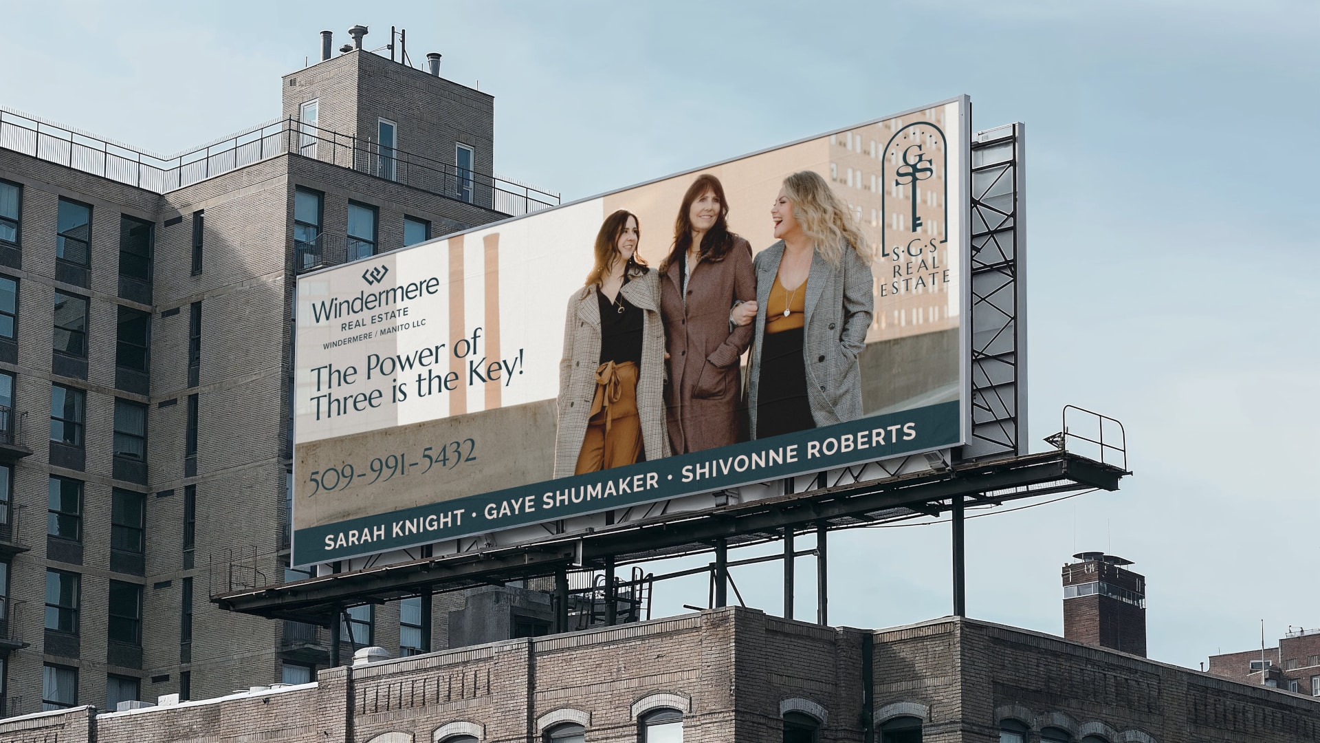
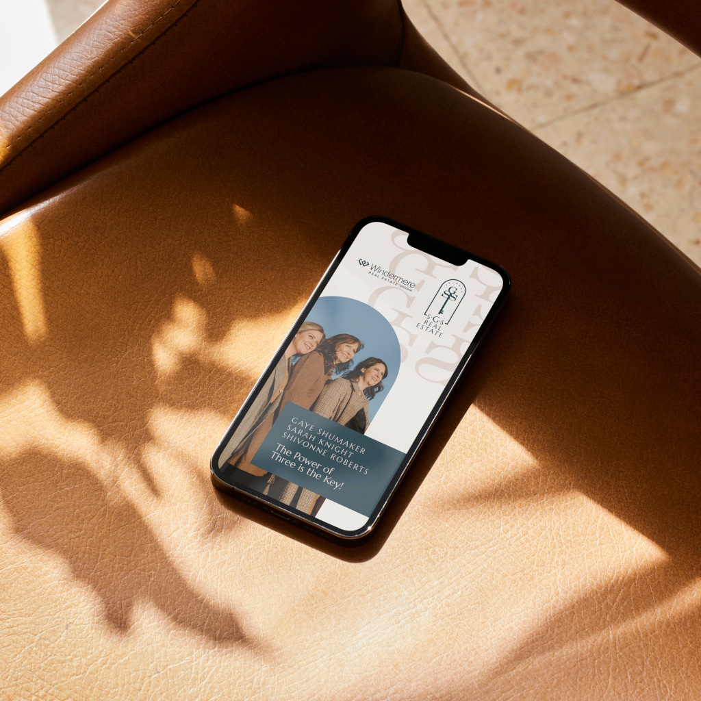
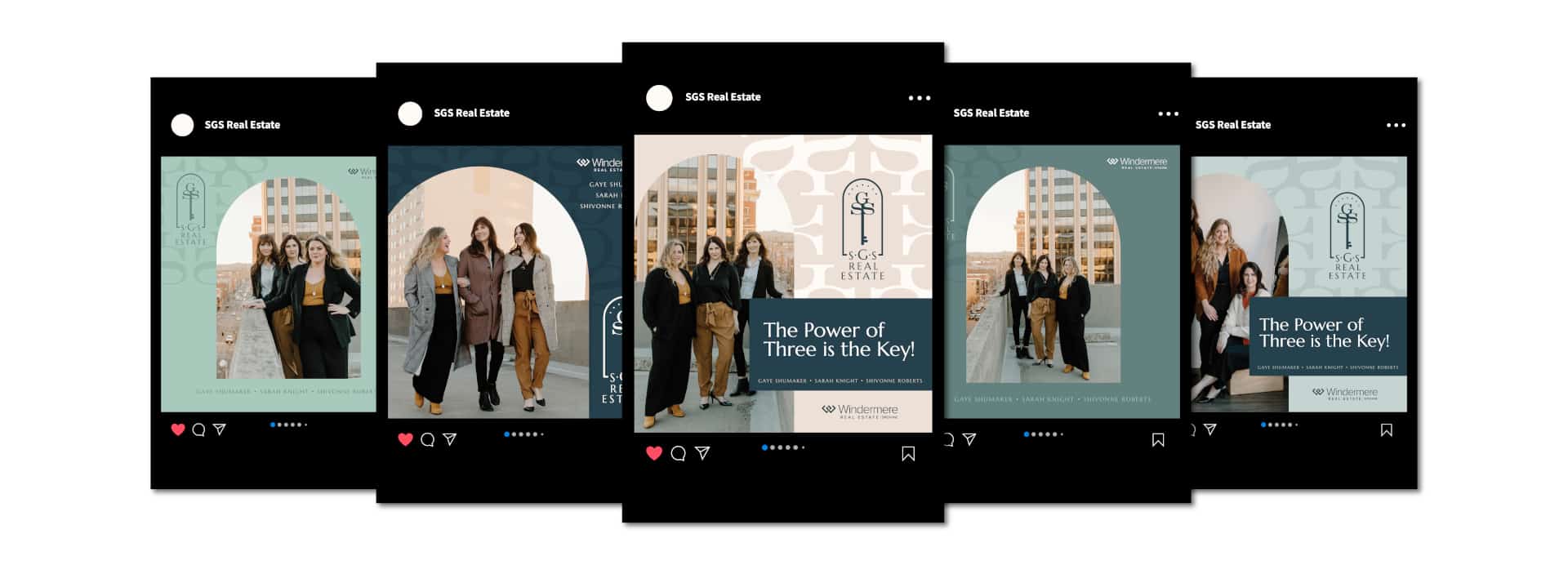
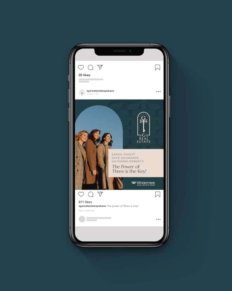
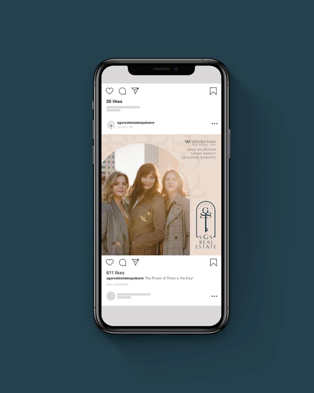
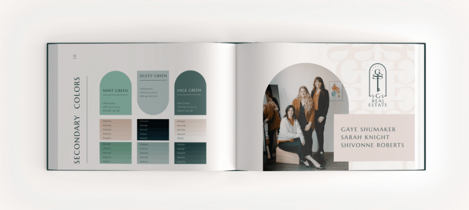
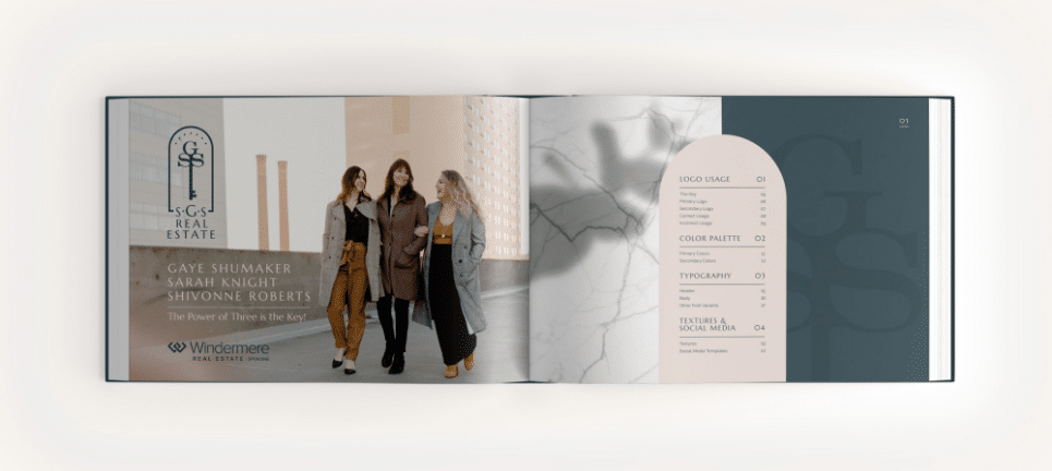
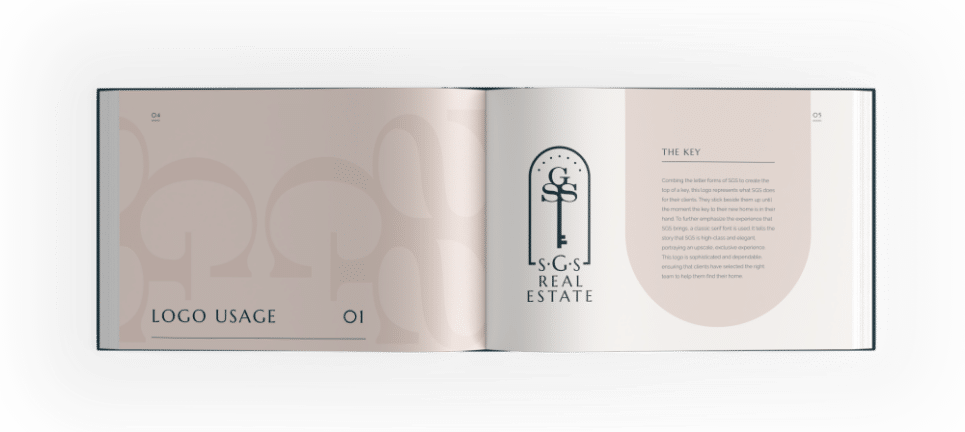
Sarah, Gaye, and Shivonne are now SGS Real Estate, where “The Power of Three Is Key!” This is a brand that aligns its team values with its personalities and the excellent service they provide. Our design team combined the letter forms of SGS to create the top of a house key, resulting in a visual aid to the real estate industry. This logo is sophisticated and dependable, ensuring clients that they’ve selected the right team to help them find their home. After defining its vision and brand, SGS Real Estate has been able to institute a consistent brand through all marketing channels, establishing them as a household name in the real estate industry in Spokane.
The Key
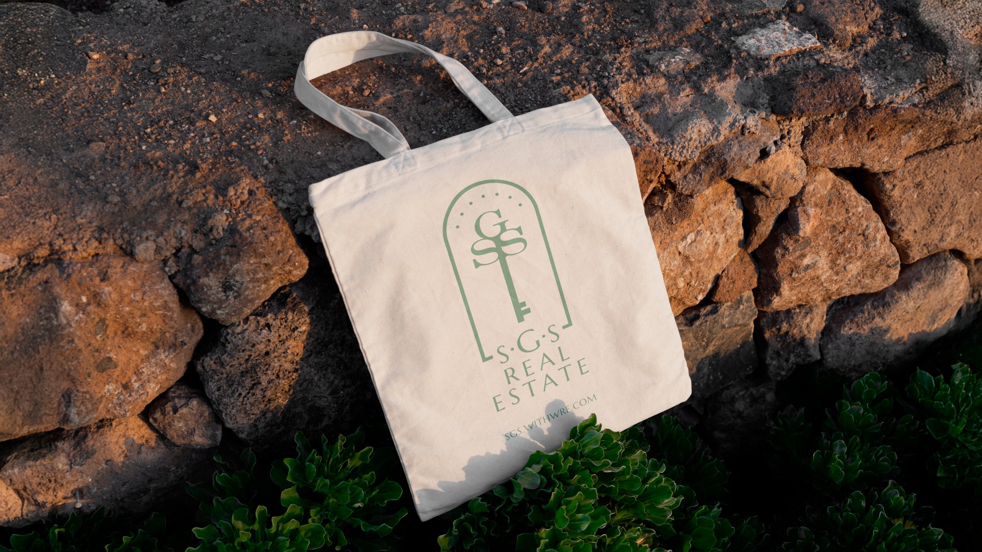
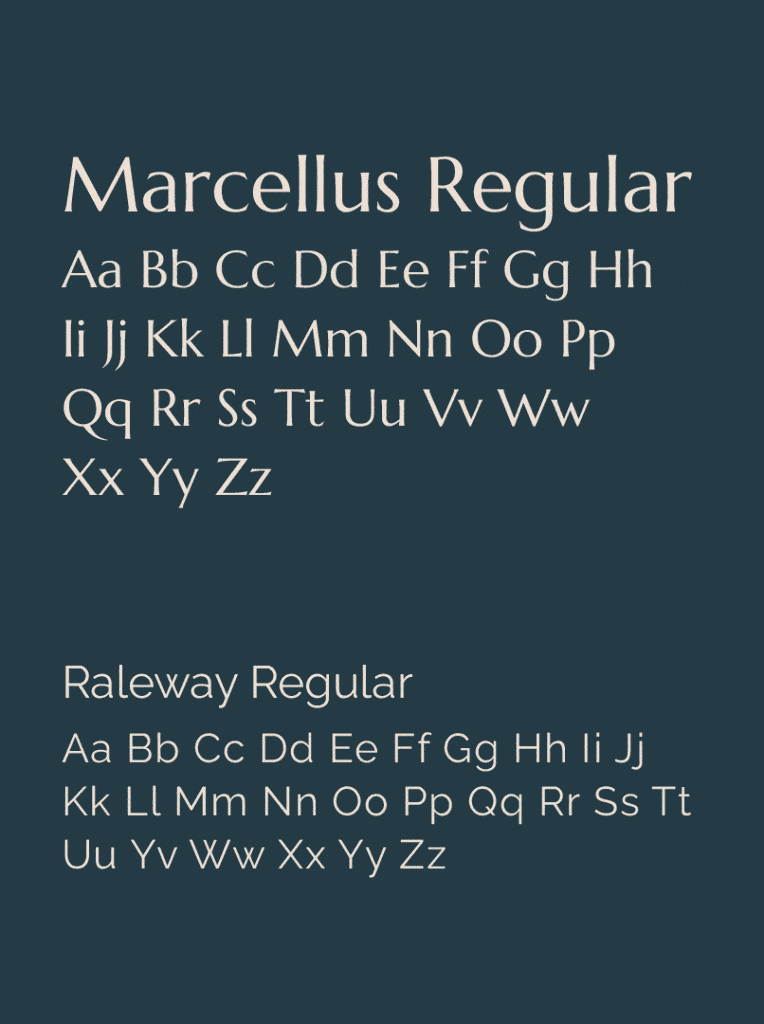
Combining the letter forms of SGS to create the top of a key, this logo represents what SGS does for their clients. They stick beside them up until the moment the key to their new home is in their hand. To further emphasize the experience that SGS brings, a classic serif font is used. It tells the story that SGS is high-class and elegant, portraying an upscale, exclusive experience. This logo is sophisticated and dependable, ensuring that clients have selected the right team to help them find their new home.
“Large Quote from the client about this particular project. Maybe Quote an email where they thanked us.”
Client Name | Spokane Conservation DIstrict
