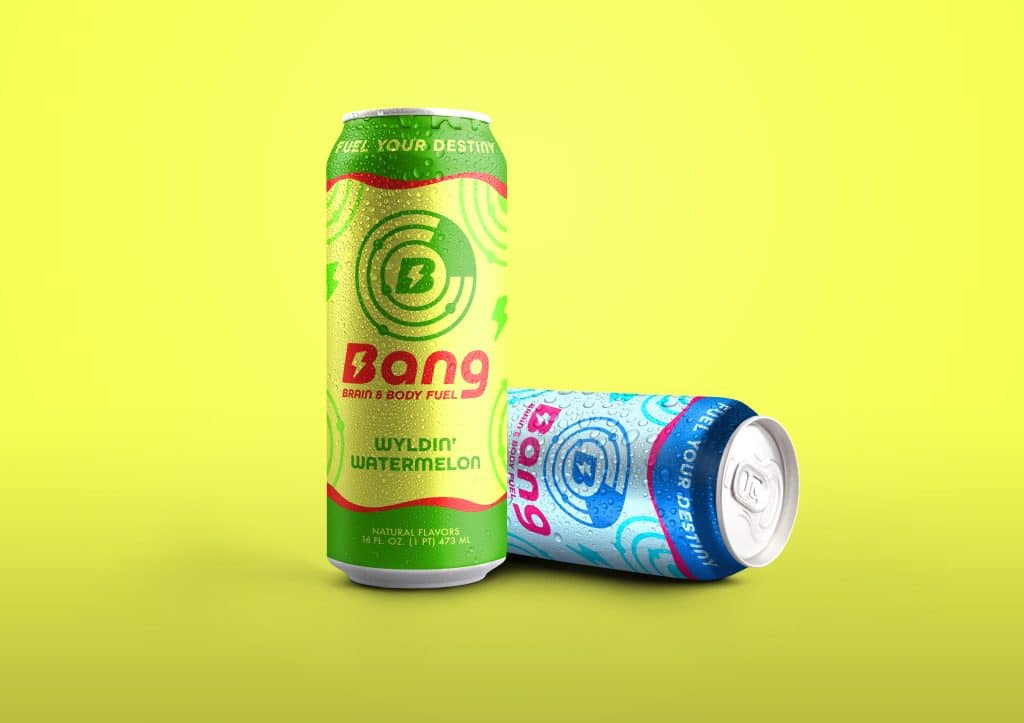
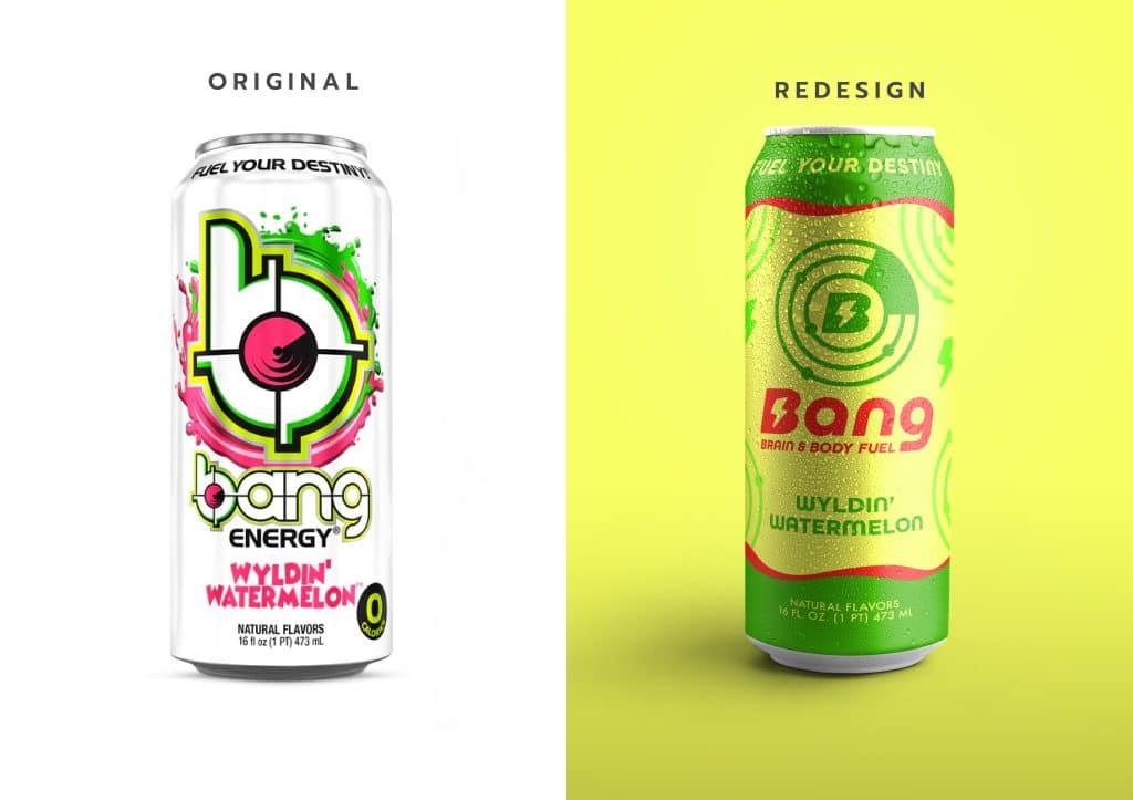
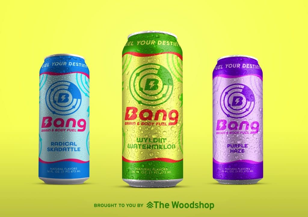
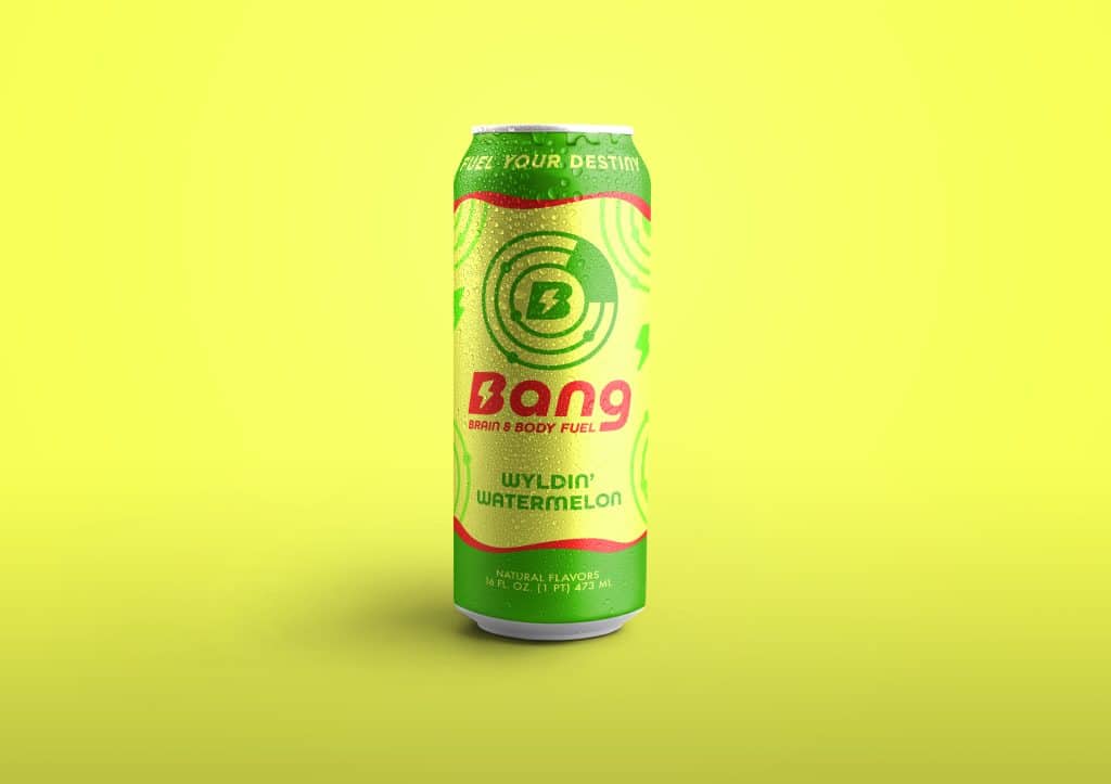
The Woodshop landed on Bang Energy Drink for our monthly redesign! Bang is such a delicious energy drink and we thought they could use a little spruce up.
The packaging for Bang is so colorful and energetic already, we wanted to make sure that we kept those aspects in this redesign. We also kept the recognizable sonar effect in the logo, but made it more simplified and clean. We also updated the primary font but kept its familiar rounded shape. This new design has all the energy (pun intended) and charisma of the original, while simultaneously adding sophistication through simplification.
What do you think about our rendition of the Bang Energy drink packaging and logo?
