The importance of a strong brand identity
Think of a brand that stands out to you – and likely its brand identity is clear. A company’s brand sets a business apart from its competitors and helps establish a unique identity that resonates with customers. Your brand identity is not just limited to the name of a business, it also includes the mission statement, core values, the company’s logo, website design, color scheme, and other visual elements that make it distinct.
As a business owner or marketer, it is crucial to understand that a strong brand identity can help you establish yourself and be familiar with consumers. Here at The Woodshop, we decided to put that to the test and see what would happen if a few of our favorite brands expanded their horizons… and started making beverages.
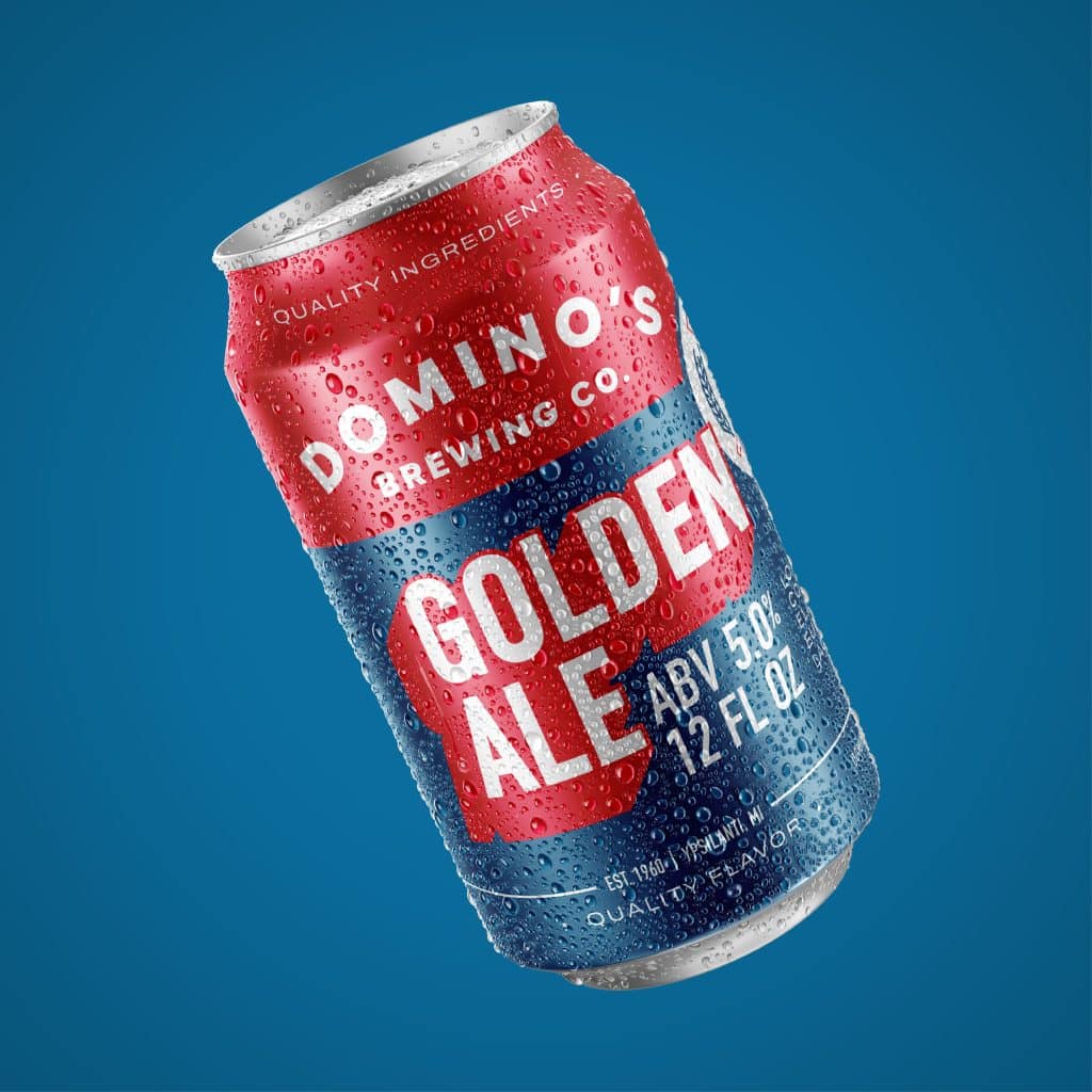
Domino's - Golden ale
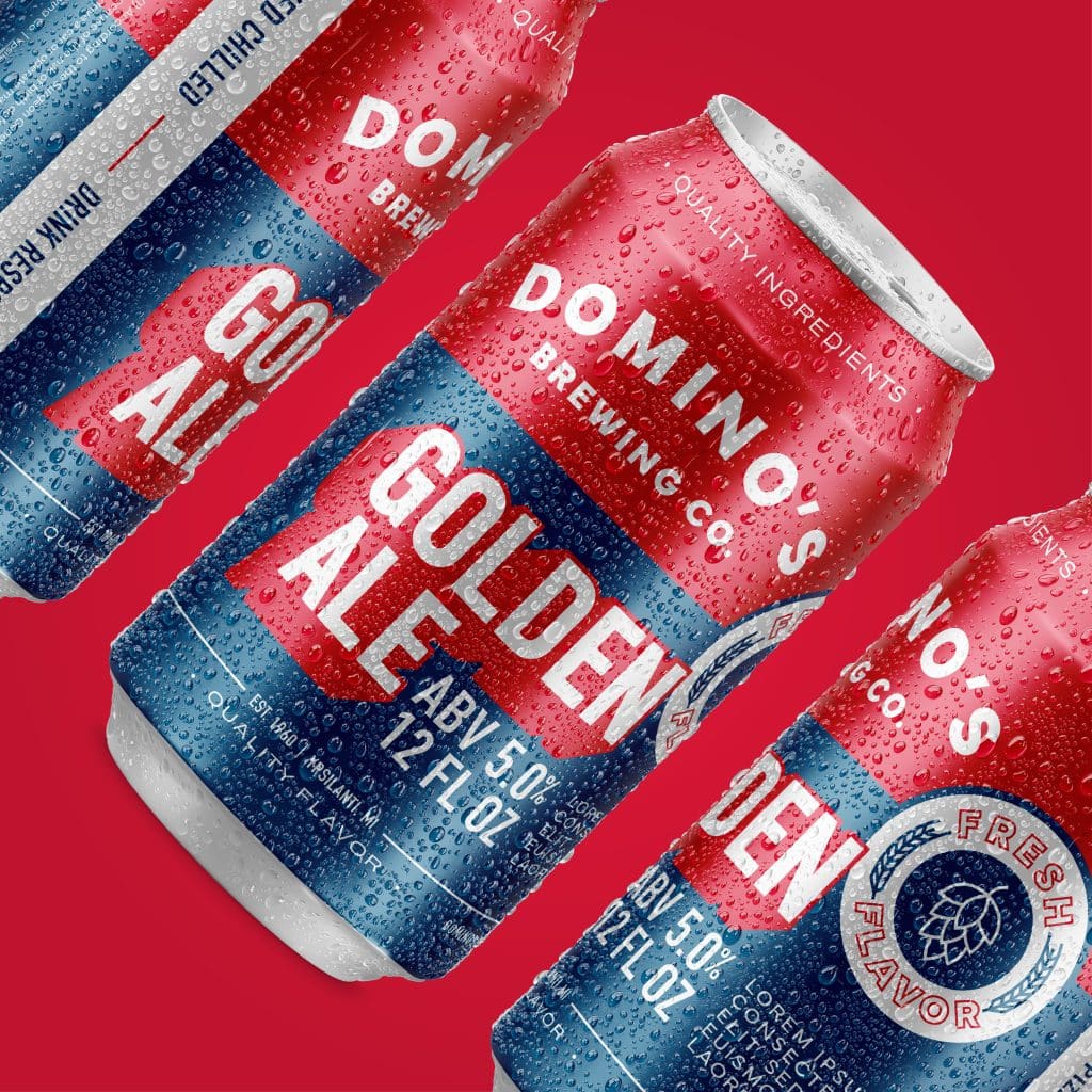
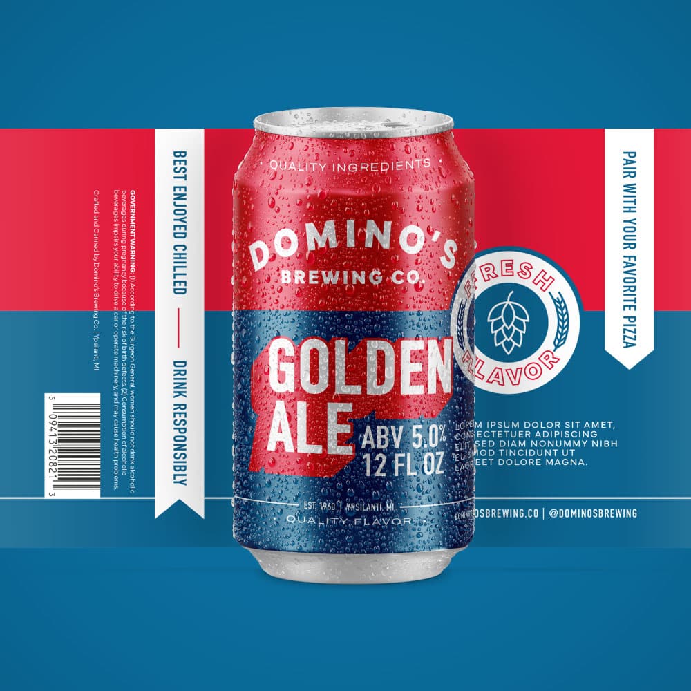
Domino’s has long been known for its delicious pizza, but what if they were to create a beer to go along with it? When it comes to their marketing, they consistently use eye-catching designs to grab the attention of their customers.
One popular design technique is the use of drop shadow effects creating a three-dimensional look. The red drop shadow effect used on the title of the beer is a great example of this. To further expand on their branding, Domino’s uses heavy typography on their pizza boxes to create a textured and rustic look that is easy to recognize. This same design principle carries over to design, with the use of banners and callouts to their high-quality ingredients and flavors.
Another way that Domino’s creates a distinctive brand identity is through the use of badges and icons. These elements are often seen as supporting elements for their brand and has been used to call attention to the fact that they use fresh ingredients, creating fresh and crisp flavors.
Instagram - hard seltzer
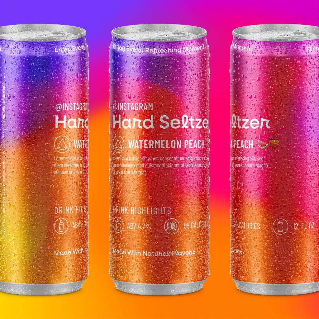
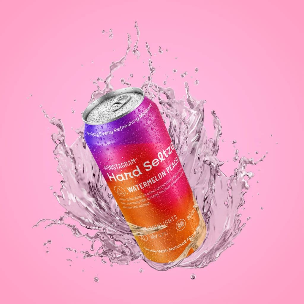
Instagram is all about creating an experience that connects people. It is a platform where people can share their experiences with anyone in the world, no matter where they are. If Instagram were to create a drink, it would be the perfect social companion. It would be enjoyed on the go for every social outing, whether it’s a game night, afternoon by the pool, or weekend away with friends. The drink would be refreshing, light, and easy to drink, making it perfect for any occasion.
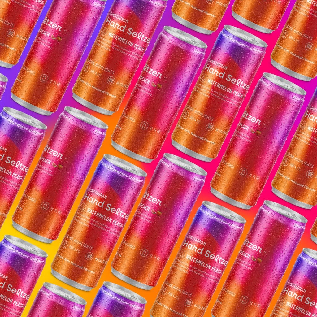
The design of the can is instantly recognizable, with the iconic Instagram gradient as the background, evoking the same feeling of excitement and energy that users experience when scrolling through their Instagram feed. The layout is inspired from an Instagram profile by using highlights to display the ABV, calorie count, and size of the drink. We’ve even included a bio on the can that describes the drink. For the typography, we’ve used their primary condensed font that you can use when making a story. And of course, we couldn’t resist using emojis to pair with the title of the drink.
patagonia - beer
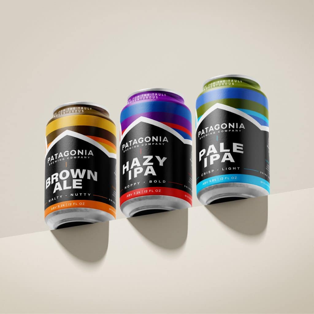
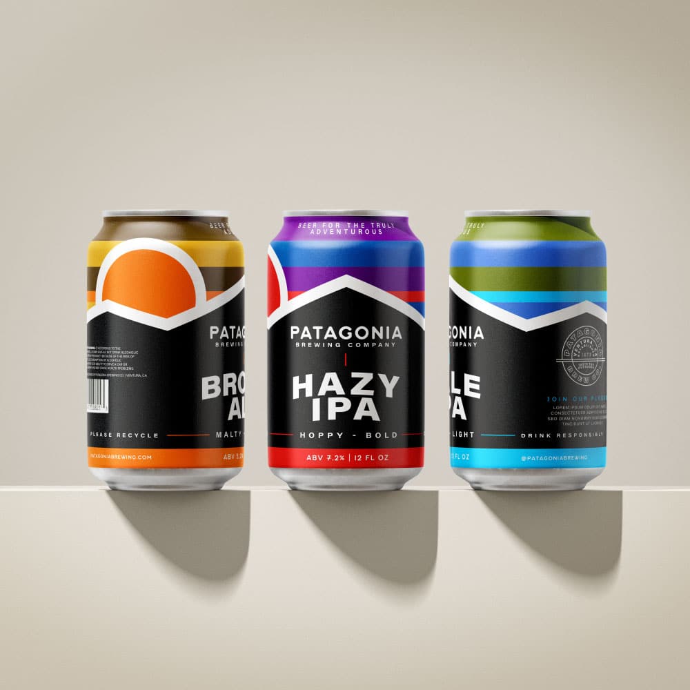
Patagonia is a brand that is synonymous with adventure and the great outdoors, so naturally, we had to take an exciting and pronounced approach to the design. The beer itself would be bold in flavor and color, perfect for a post-hike drink around the campfire.
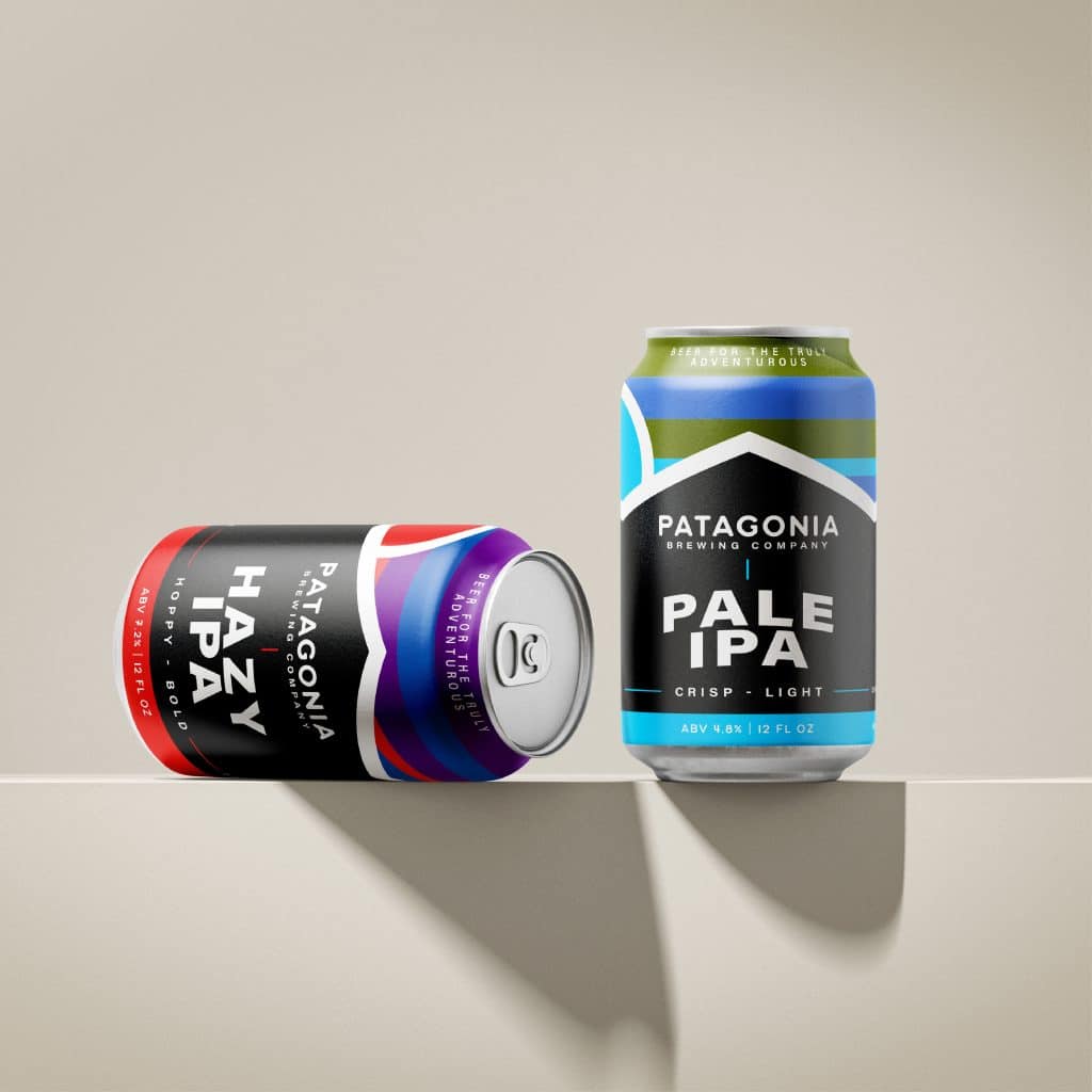
This feeling is reflected in the colors used for each can to demonstrate the type of beer. The use of bold lines that are found in their logo are also incorporated into the design to help create a cohesive look across all cans. The minimal use of typography on the label also adds to the boldness of the design. It reflects the simplicity and ruggedness of the outdoor lifestyle that Patagonia represents.
Along with this, Patagonia marketing has always been an advocate for the environment, so we wanted to tie this into elements found on the can. This is done by including a call to attention to join a pledge to protect the environment as well as specifically calling out that the packaging is recyclable. By enjoying a Patagonia beer after a long day of exploring, you are not only supporting the company’s mission but also enjoying a drink that reflects the same adventurous spirit that brought you to the great outdoors in the first place.
Spotify - Sparkling Mixer
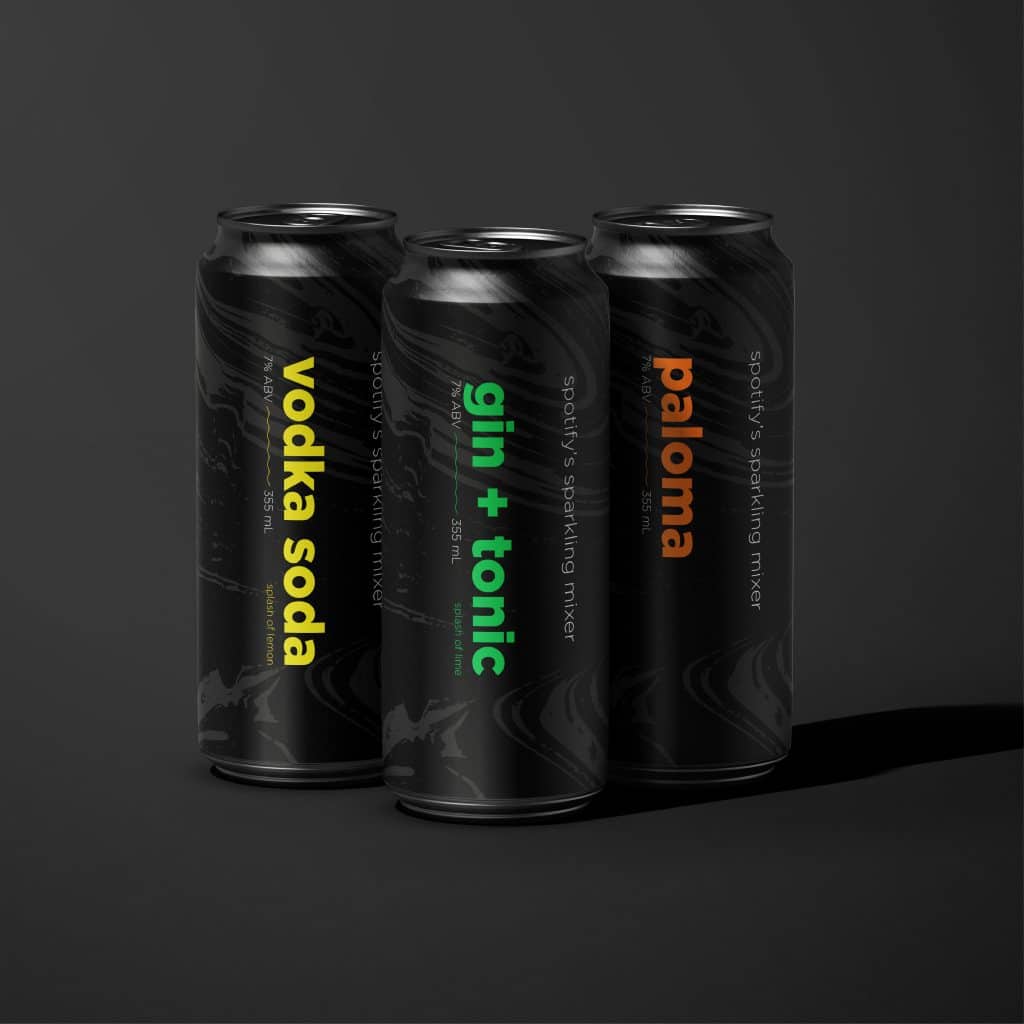
Spotify is a company that is well-known for its vibrant and bold brand identity. If Spotify were to create a drink, it would have to reflect the same energy and excitement that the brand is known for.
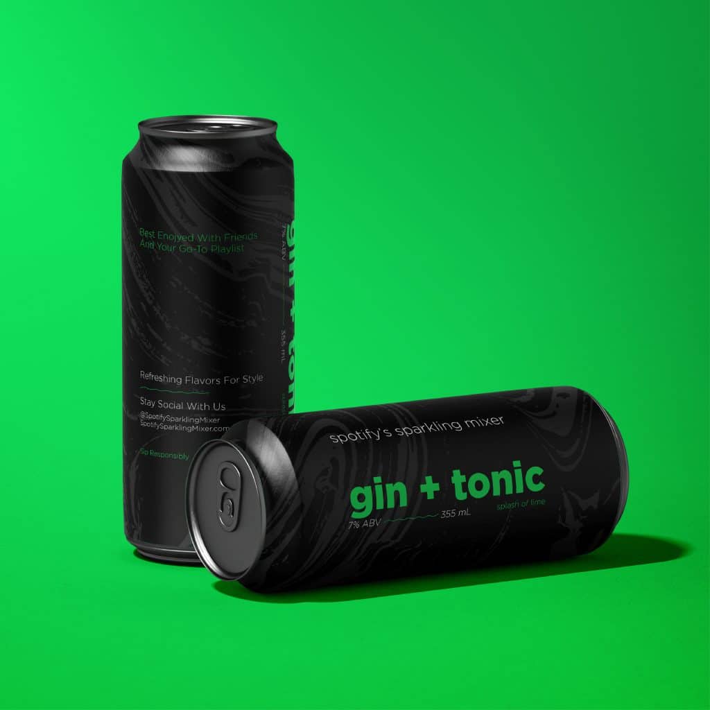
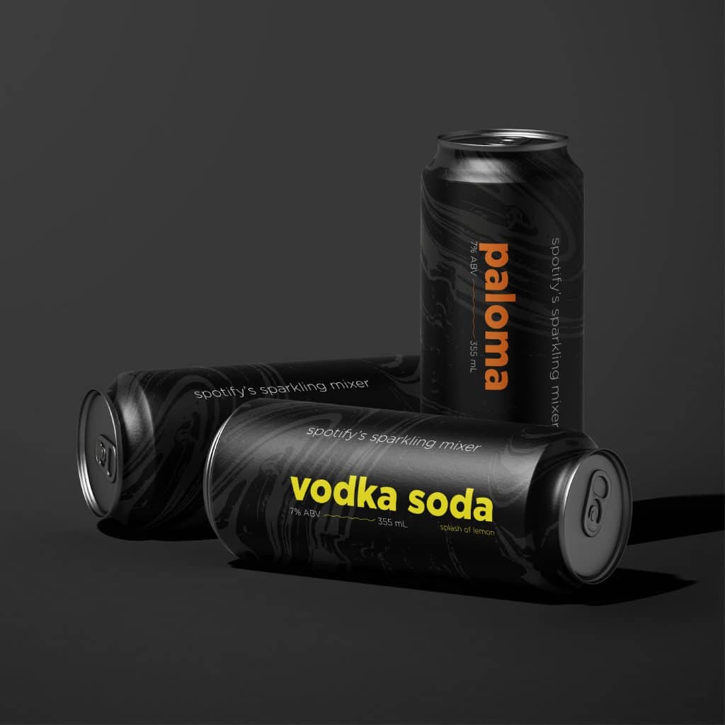
With this, the design we have created is a mixer that would come in a variety of flavors, each with a different color corresponding with a music genre to dance the night away. For example, we have created one that is a green drink that represents electronic dance music and a yellow drink that represents pop music.
This design is sure to stand out. The matte can features a textured background with movement reflecting a crowd of people dancing. The flavor of the drink is a vibrant color that demonstrates the bright lights coming off the stage. Lastly, the typography is simple but effective, with a sans-serif font that is easy to read from a distance. I don’t know about you, but this makes me want to buy tickets to a concert immediately.
